Maquette Vault
Support VR Content Creation for Design Enthusiasts
Project Overview
Maquette Vault is a community add-on to the existing VR prototyping tool “Microsoft Maquette”. Using a VR headset and hand tracking, users share their projects and inspire each other by contributing to and consuming user-sourced projects. The platform improves communication between a project maker and a viewer by using a new method of pointing & annotating that highlights parts of a completed prototype, allowing the creator to explain their prototype.
Sponsor:
Microsoft Azure Cloud
Duration:
02/2020 - 08/2020
Team Member:
Harri Lin (Me!), Lisa Liu, Mehul Shah
Role:
Product Design, Interaction Design, 3D Animation, Visual Design, User Research
Notice: To fully comprehend this project, please watch this video at the front
Project Background
“Designers should care [about XR] because the market that has provided them with reliable work over the past few decades is about to shift towards a new paradigm of immersive 3D content. Sound, touch, depth, and emotion will all be integral to the [AR]/VR experience, making even the most novel 2D screen experiences feel boring and dated.”
— Blake Hudelson - Designing for VR | A Beginners Guide
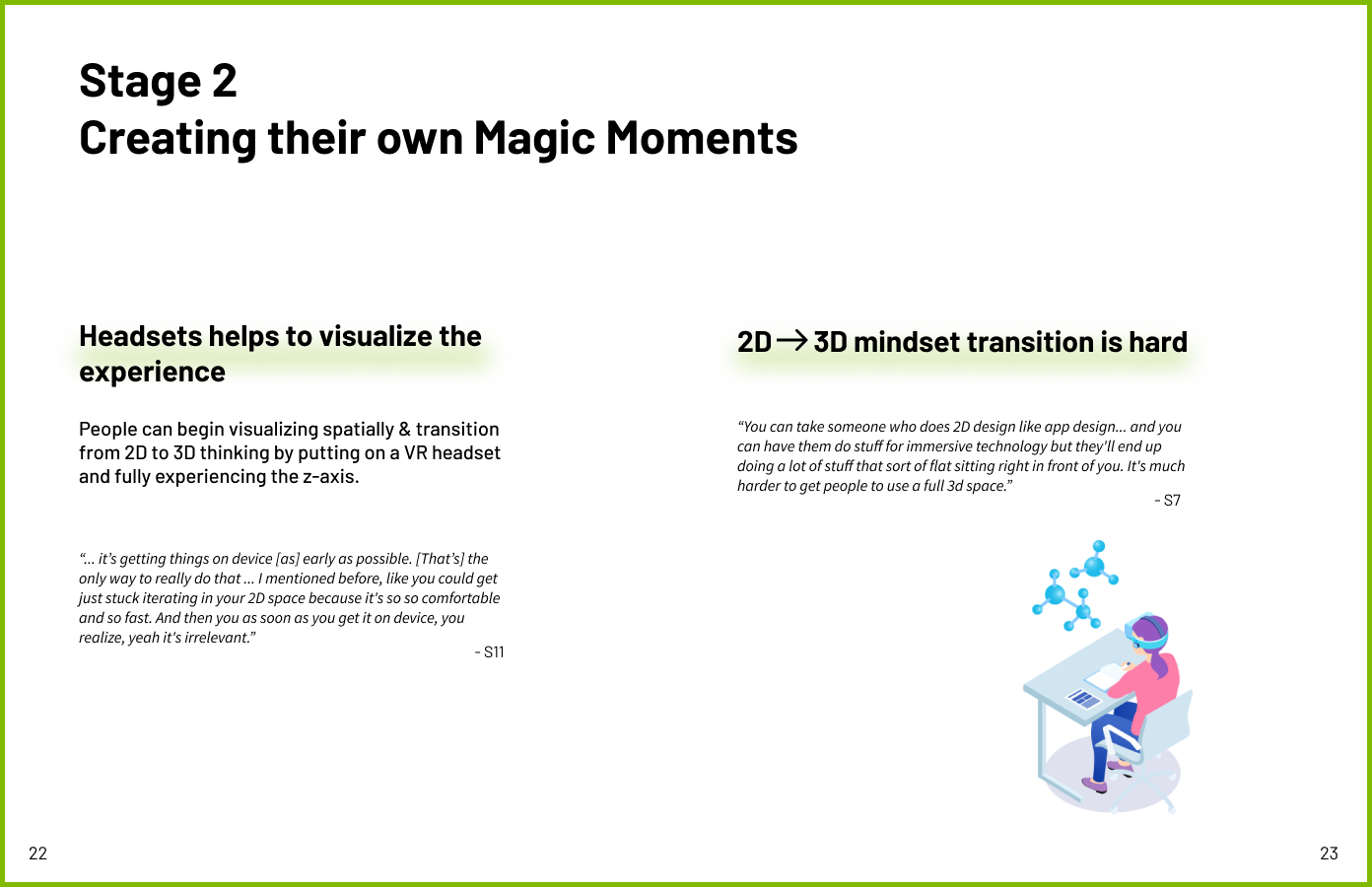
“You can take someone who does 2D design like app design... and you can have them do stuff for immersive technology but they'll end up doing a lot of stuff that‘s still pretty 2D. It's much harder to get people to use a full 3D space.” - One of our SMEs
Design Challenge
Designing for VR is difficult. There is an additional axis to deal with, quality content is few and far between, and learning resources are hard to find.
Our goal is to encourage more designers & content creators to join the VR space by inspiring them to learn from other creators’ work.
Product Highlight
Interaction Input
Hand Gesture Interaction
Users use hand gestures as input to interact with spatial content in the headset. Unlike other input devices, hand tracking is automatically present as soon as users put on a VR headset.
Related research insights: Hands are highly approachable and low-friction input that requires no additional hardware. Self and social presence are richer in experiences where users are able to use their real hands.
Inspiration Discovery
User-Sourced Ever-Expanding Platform
Users browse through unique creations uploaded by other content creators and take inspiration for their own designs. Users appreciate their favorite VR projects by recommending & leaving audio-to-text notes to bring the best projects & interactions to rise to the surface
Related research insights: Designers need help understanding spatial interactions and VR principles. At the same time, they have a hard time finding learning resources, like-minded community, and inspiration.
Active Functions
Special Slider to Activate Functions
Users do a long pinch with their thumb and index finger on their hand to bring up a high-level menu. Then they slide towards the direction of annotating to activate the different menu.
Related research insights: Having lots of functions around users is very easy to trigger mistakes. In order to reduce error, we decided to divide all features into 3 different modes.
Demonstrate Spatial Interaction
Annotations for Interaction
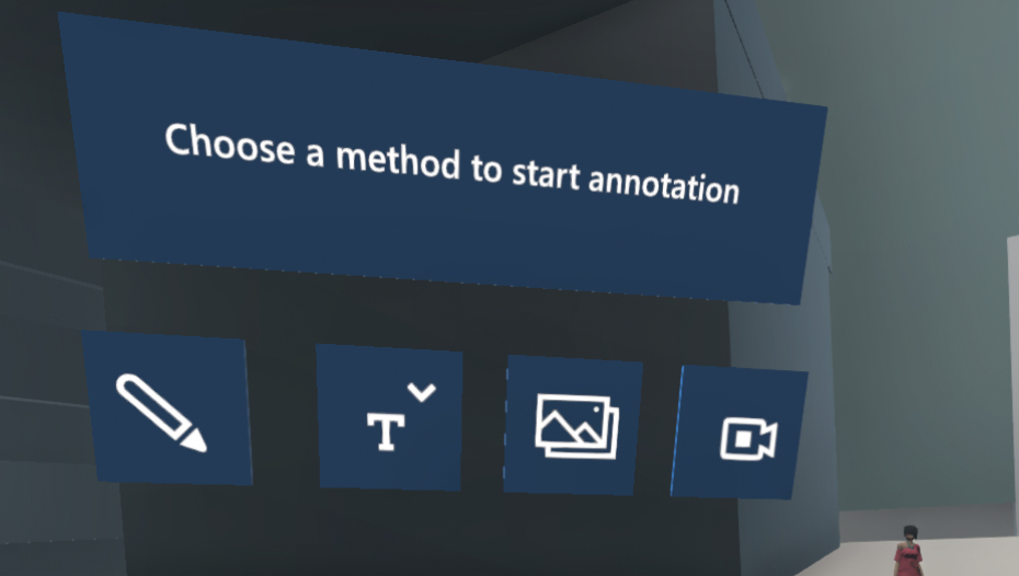
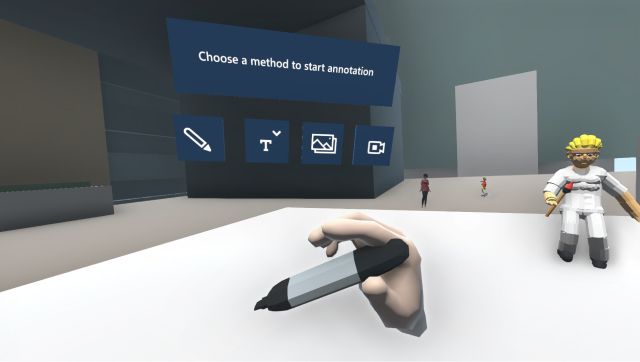
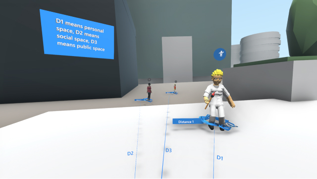
Content creators use 3 special annotation functions to tell visitors how to interact with objects spatially and demonstrate applications of VR principles.
Related research insights: New designers usually do not have mental models for some spatial interaction. They need some guidance from the author to demonstrate how to interact in the VR space.
Research
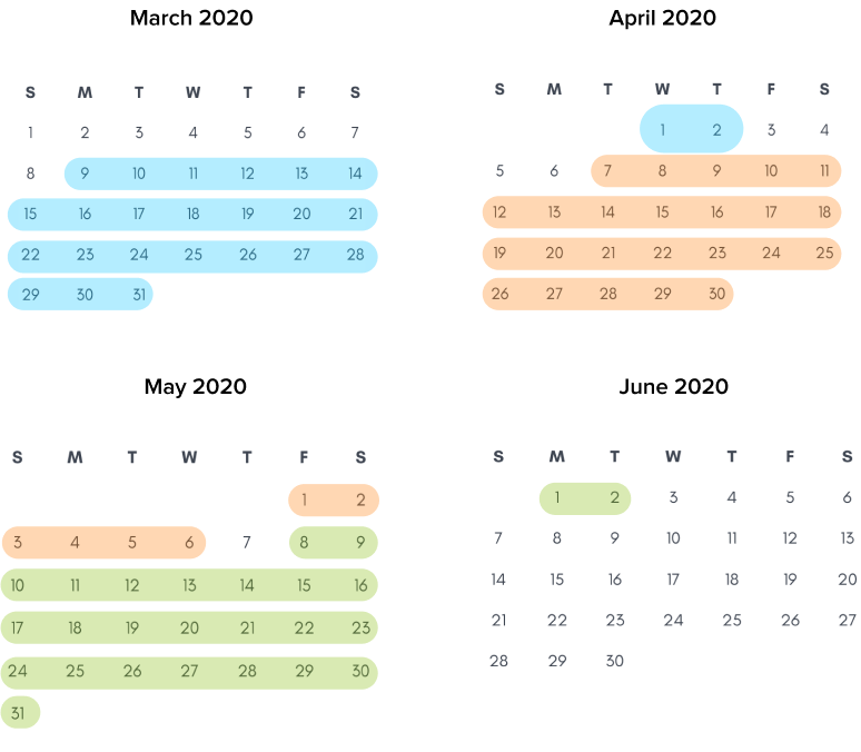
Our team went through 3 cycles of research that lasted for 13 weeks in total. Each cycle led to the following cycle. The following visual calendar shows our research process.
Cycle 1: Explore the AR/VR Field (4 weeks)
Cycle 2: Deep Dive into Industry (5 weeks)
Cycle 3: Reflect on Personal Journey (4 weeks)
Research Methodology

Literature Review
We reviewed 65 papers and articles in terms of reality technology, design for multi-demension, optics.

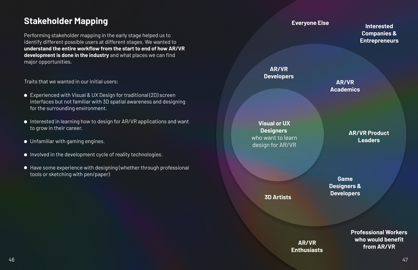
Stakeholder Mapping
We kicked off the project by conducting the stakeholder mapping activity to identify the relationship among target users.

Competitive Analysis
We evaluated 12 competitors (VR prototyping software) using metrics of adaptability, flexibility, and usability.
Screener
We structured a screener to recruit specific people who fit into our personas.

Target User Interview
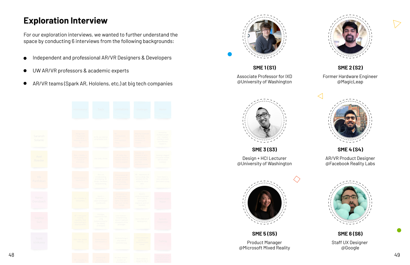
We recruited and interviewed 13 AR/VR/MR enthusiasts who hope to make a career change into the reality technology industry

SME Interview
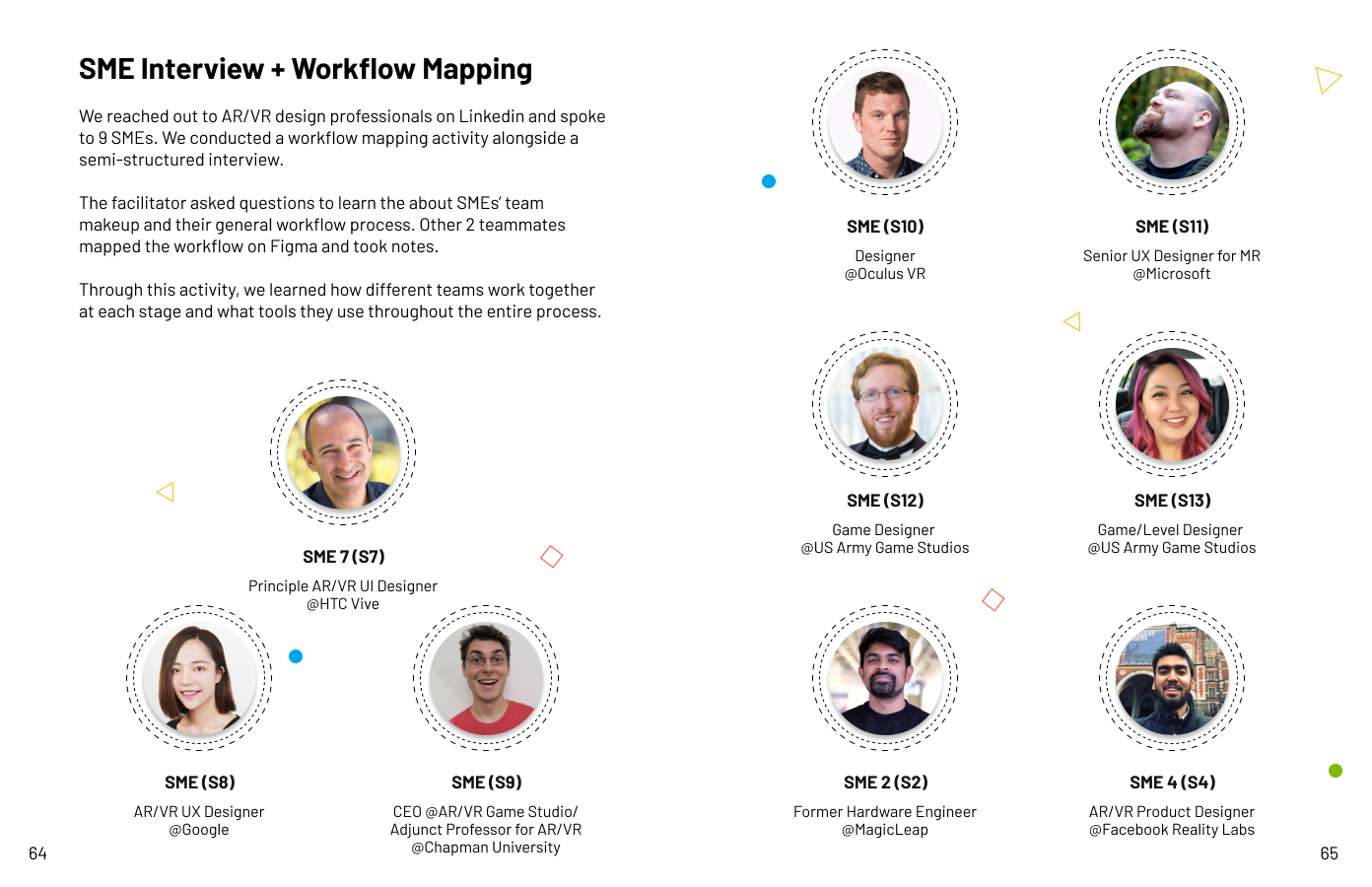
We reached out and interviewed 15 SMEs and professionals who are currently working in the real technology industry.
Marketing Research (Survey)
We sent out a survey at the later stage of our research to identify the potential opportunities for our project.

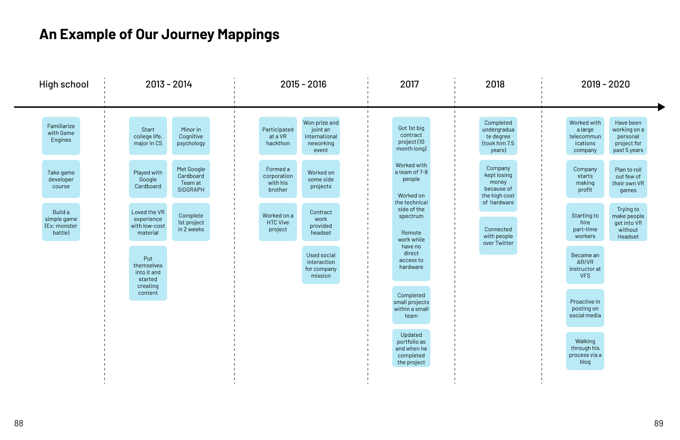
Journey Mapping
We performed 7 semi-structured journey mapping activities while we were conducting the target user interviews.

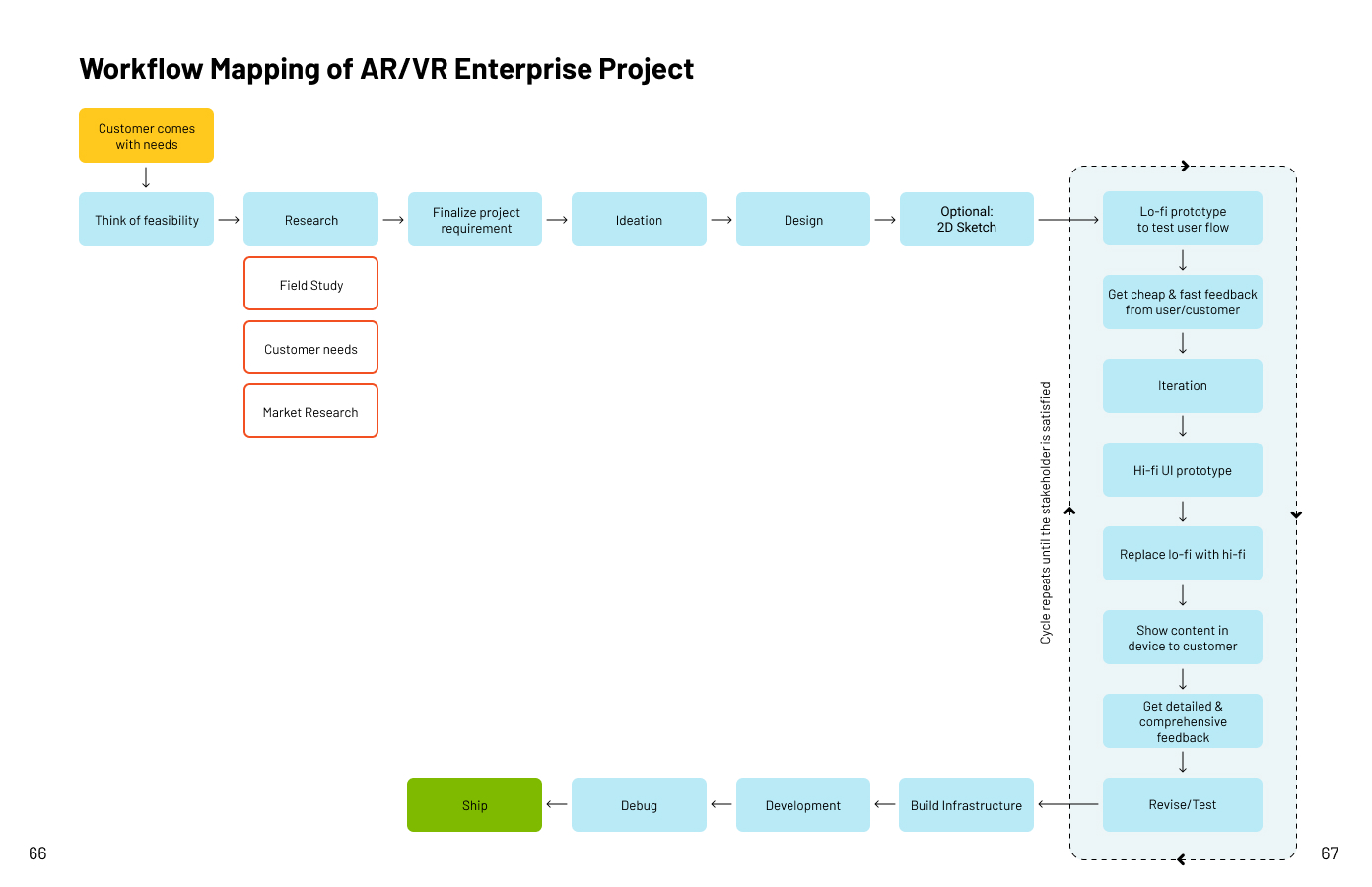
Workflow Mapping
We conducted 5 semi-structured workflow mapping activities during the SME interview.
High-level Insight
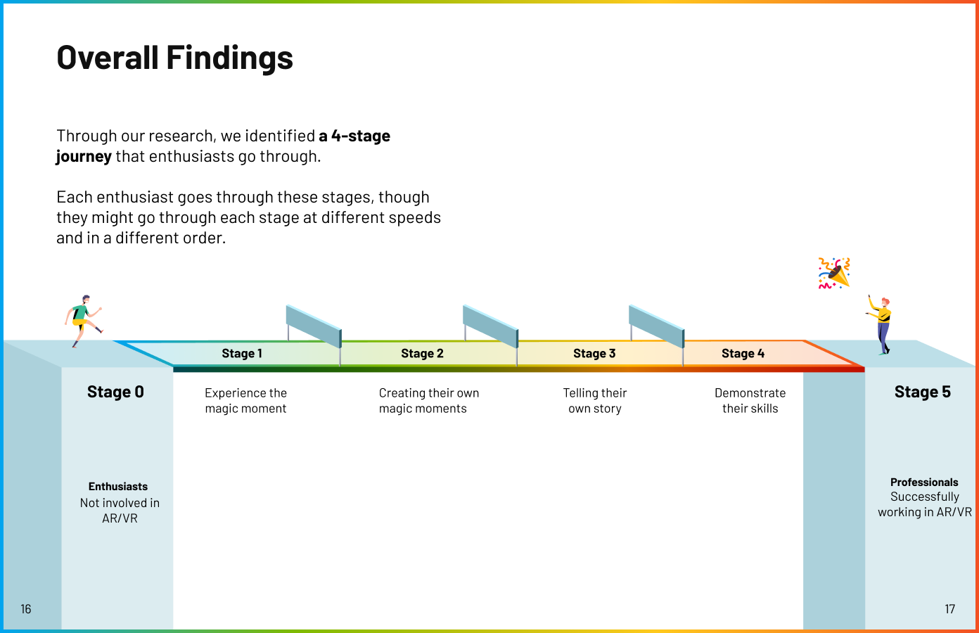
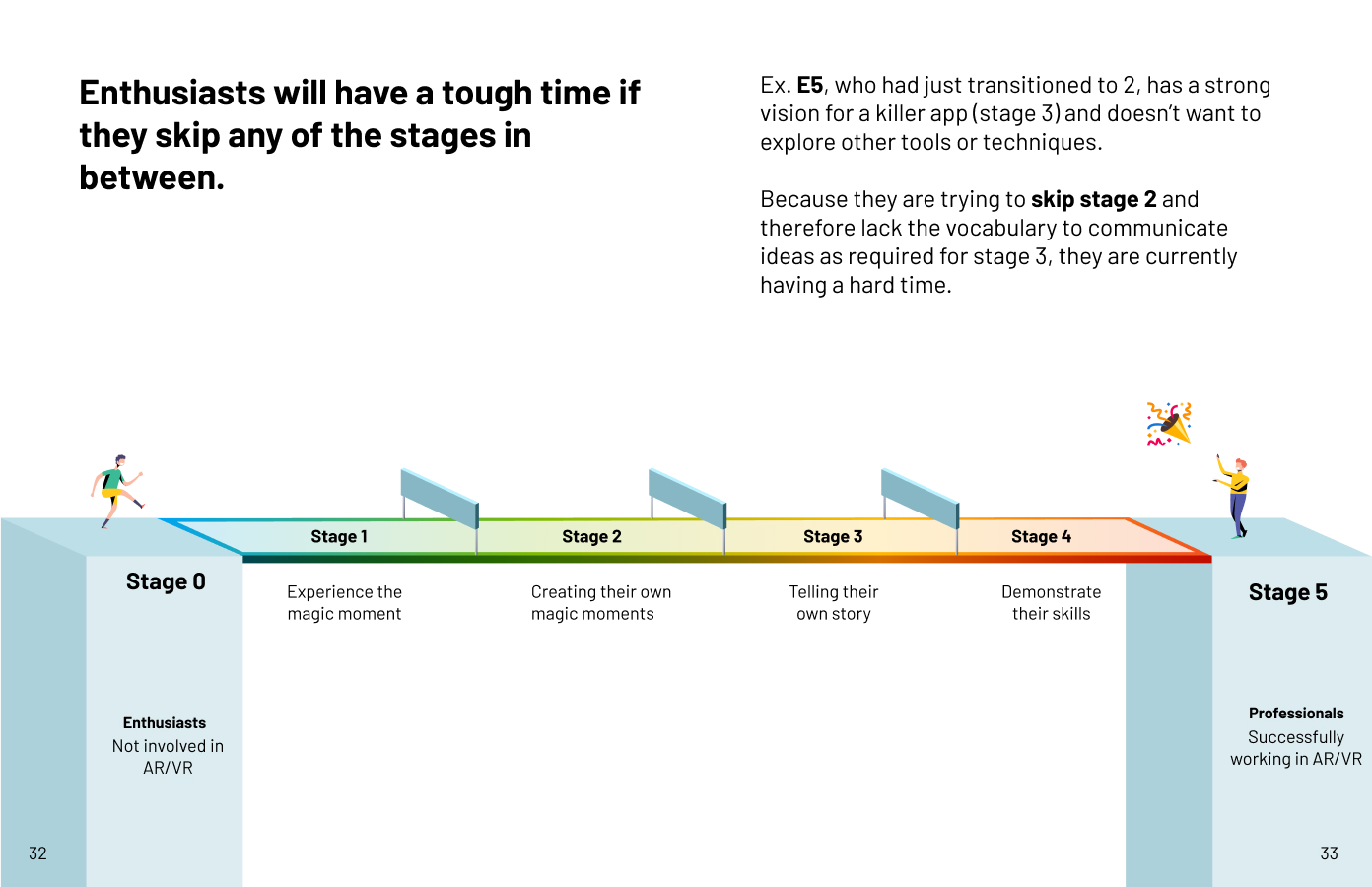
6-Stage Journey
Through our research, we identified a 6-stage journey that enthusiasts go through. Each enthusiast goes through these stages, though they might go through each stage at different speeds and in a different order:
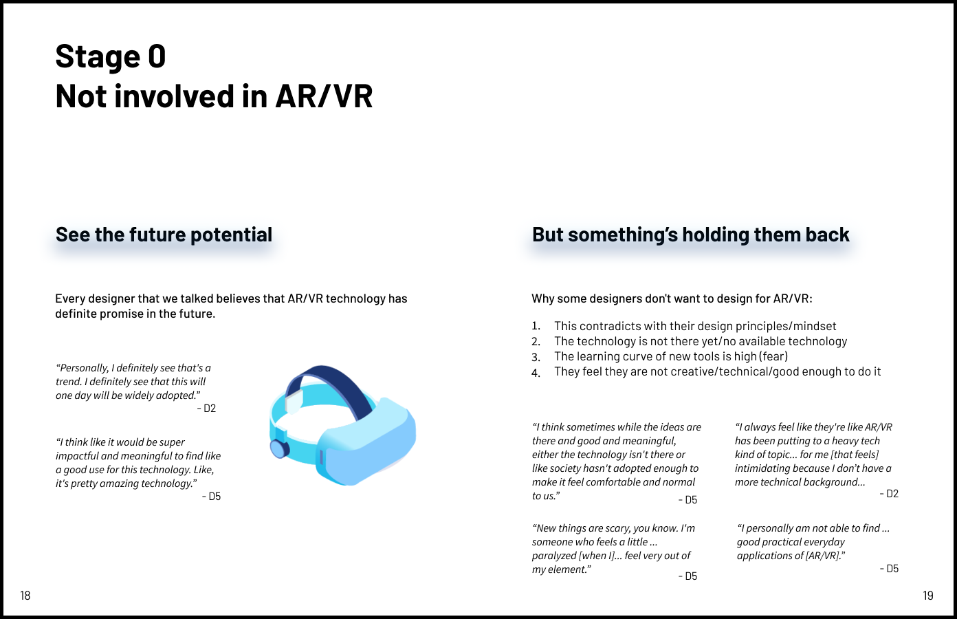
Stage 0: Not involved in AR/VR
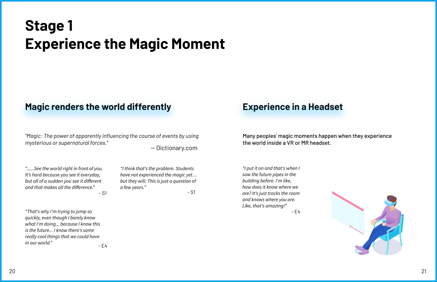
Stage 1: Experience the magic moment
Stage 2: Learning through struggling
Stage 3: Telling their own story
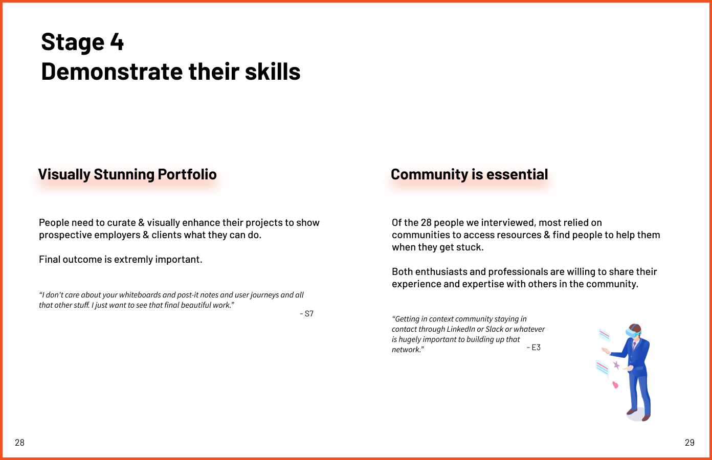
Stage 4: Demonstrate their skills
Stage 5: Successfully working in AR/VR
Enthusiasts will have a tough time if they skip any of the stages in between. Ex. a user who had just finished stage 1 and has a strong vision for a killer app (stage 3) and doesn’t want to explore other tools or techniques. Because they are trying to skip stage 2 and therefore lack the vocabulary to communicate ideas as required for stage 3, they are currently having a hard time.
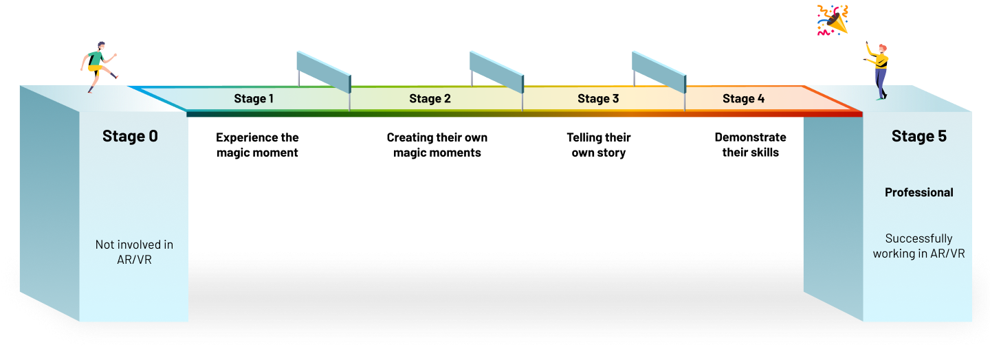
Here is an info-graphic of the 6-stage journey created by me
Opportunity
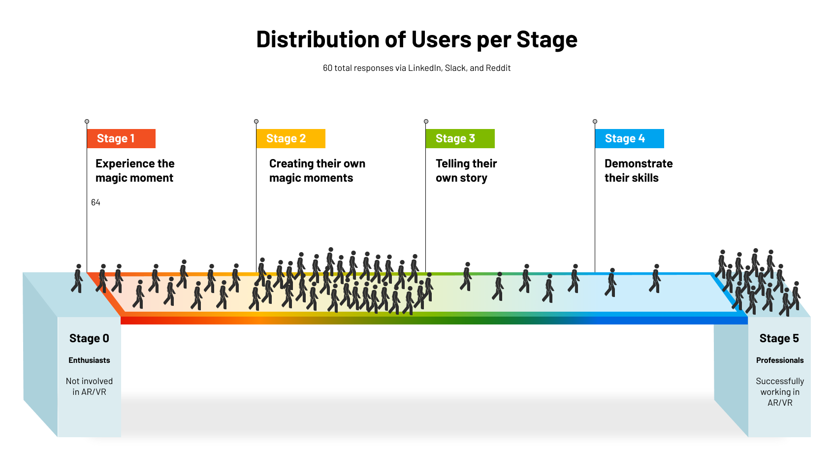
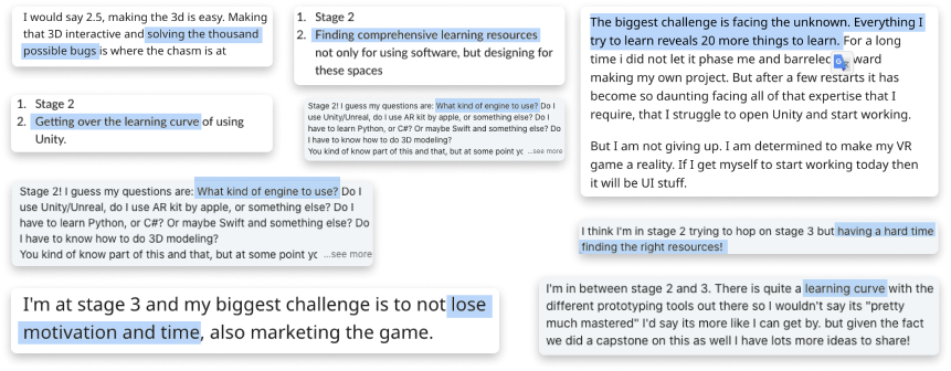
I led the marketing research (survey) by sharing the succinct version of our research report on social media including Linkedin, Reddit, multiple related technologies. By posting our report, we collected 60+ responses, and over 50% of users states they get struggled at stage 2 while lacking time, resource, passionate to move forward. Form there, my team decided to target stage 2 to help more designers move to reality technology filed easily so they could create more content for this field.
Challenges at Stage 2: Learning Through Struggling
After enthusiasts experience the magic, they want to recreate it for themselves through exploring tools and finishing simple projects. They have to adjust to a few things:
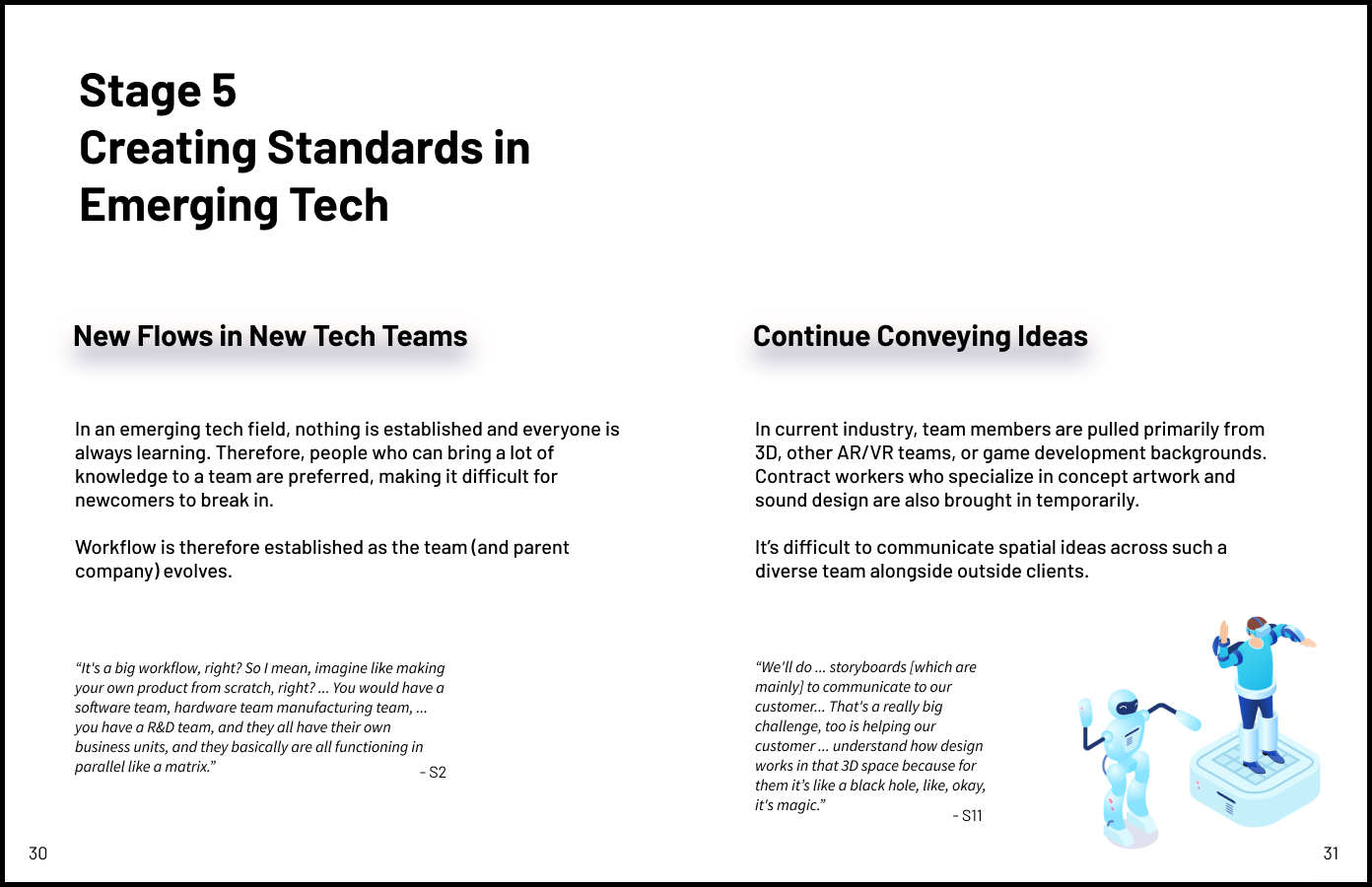
2D -> 3D mindset transition: transitioning from a 2D mindset to a 3D mindset is a challenge, for some more so than others. To fully visualize the space, enthusiasts may need to buy a headset. We learned that people begin visualizing spatially just by putting on a VR headset and fully experiencing the z-axis.
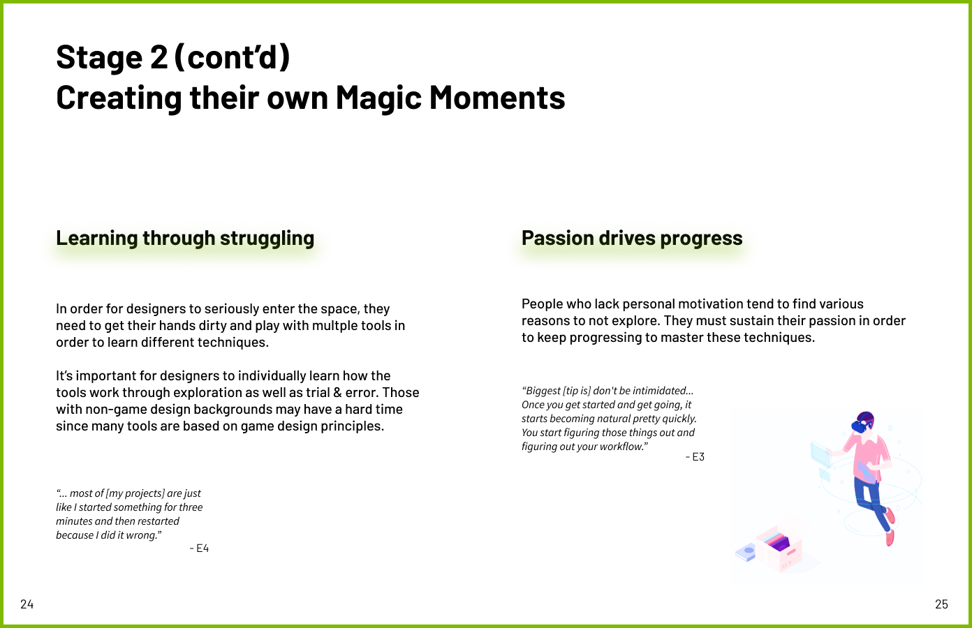
Troubleshooting with developer mindset: In order for designers to seriously enter the space, they need to get their hands dirty and play with multiple tools to learn different techniques. It’s crucial for designers to individually learn how the tools work through exploration as well as trial & error. Those with non-game design backgrounds may have a hard time since many tools are based on game design principles.
Challenge of sustaining passion: People who lack personal motivation tend to find various reasons not to explore. They must maintain their passion for keeping progressing to master these techniques.
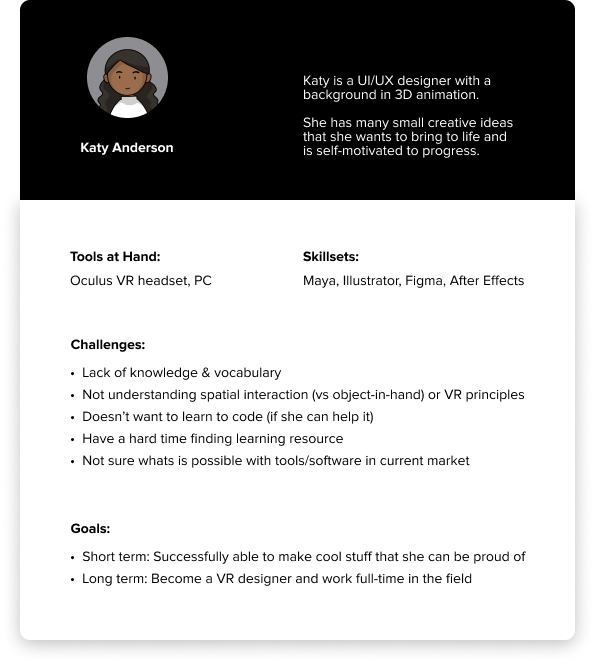
Persona
We developed 1 particular persona based on the quotations and insights from our research participants -- that of a motivated designer with a varied but non-technical background.
It was also at this point that we settled on VR prototyping, as we set the device as an Oculus headset.
Desired Outcome

Foster Synchronization
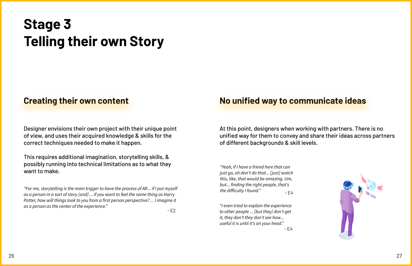
We want designers to have the ability to synchronize their concepts and ideas more easily across different stakeholders despite having different backgrounds and knowledge.

Sustain the Magic Feeling
It’s very easy for people to quit during the journey because of multiple reasons. We want to provide reassurance for people at various stages to sustain their initial magic feeling so they can finish the entire journey with tireless tenacity.

Simplify Complexity
Many existing tools are complicated and feel overwhelming to use. We want our solution to simplify a very complex technology into something easy to grasp.
Break Free of 2D
We want users to have the ability to more naturally convey 3D spatial ideas to other people without compromising their original vision (which often means degrading it to a 2D version or verbal instructions).
Ideation
We came up with 60 different ideas according to our design principles, which we took the best parts of and combined into our resulting idea: creating a community add-on(Vault) to existing VR prototyping tool “Microsoft Maquette”.


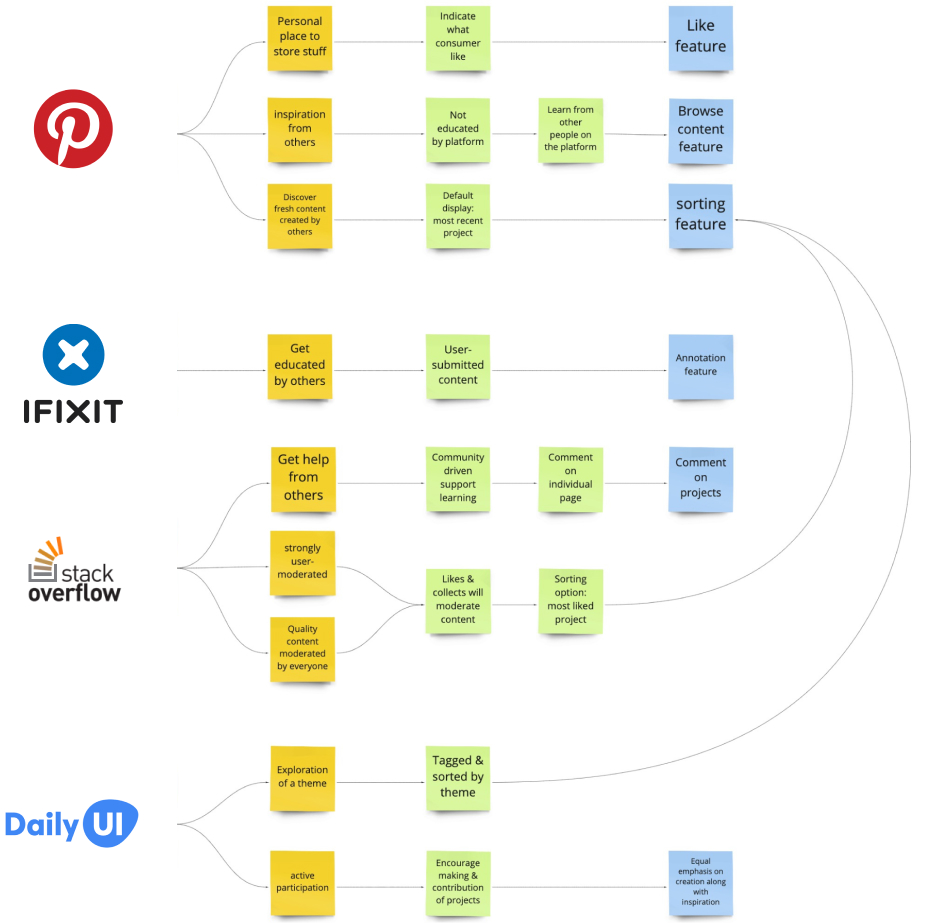
Community Value
We took inspiration from the community values of Pinterest, iFixIt, StackOverflow, and even the Daily UI Challenge to develop our own values:
- Resources are inspiring, transparent, and not intimidating
- Promote active learning by doing
- Learning is community-driven, not dictated by designated experts
Conceptualization
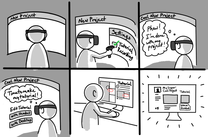
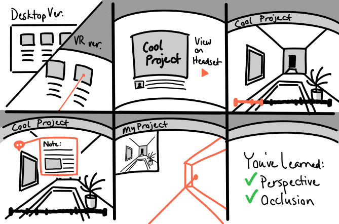
We storyboarded this concept to help us visually understand how our users can navigate between different interfaces.
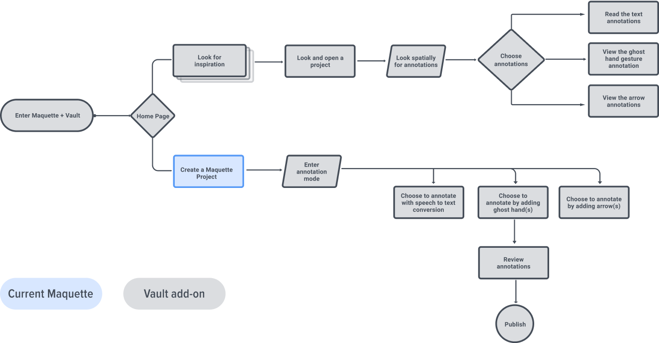
High-Level User Flow
We knew we didn’t want to make a Figma for VR prototyping, but rather add onto an existing product that is a community and annotation methods for sharing. So we decided to build off of Microsoft Maquette.
We also nailed down our key features because we needed to know exactly -- what to make for our prototype since our final artifact was going to be technology-heavy.
The chart on the right represents our high-level user flow. The steps in the blue box belong current maquette’s function while the steps in the gray box represent our newly added functions.
1st Prototype
Prototyping in VR
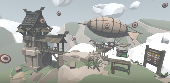
Based on our research, we learned that the best way to prototype for VR is to “just do it”. Designing for VR isn’t the same as designing a 2D interface -- a user has to put themselves into the immersive medium for at least 100 hours to learn how this space works and reacts to them. Therefore, we decided to jump right in.
We used Microsoft Maquette’s existing design elements & conventions to make our first prototype,
Challenges & Reflections:
We soon realized that we weren’t satisfied with only using what was already there. And then our team made the decision to design for the Maquette of the future, rather than the Maquette of right now because of the following reasons:
- We had to limit our ideas in order to fit within Maquette’s current features, and it made our designs very flat.
- The only interaction we had was the viewpoint teleportation, and that wasn’t enough for us to show the entire space.
- We didn’t want to design around Maquette’s existing palette functionality -- we want to make things our own.
2nd Prototype
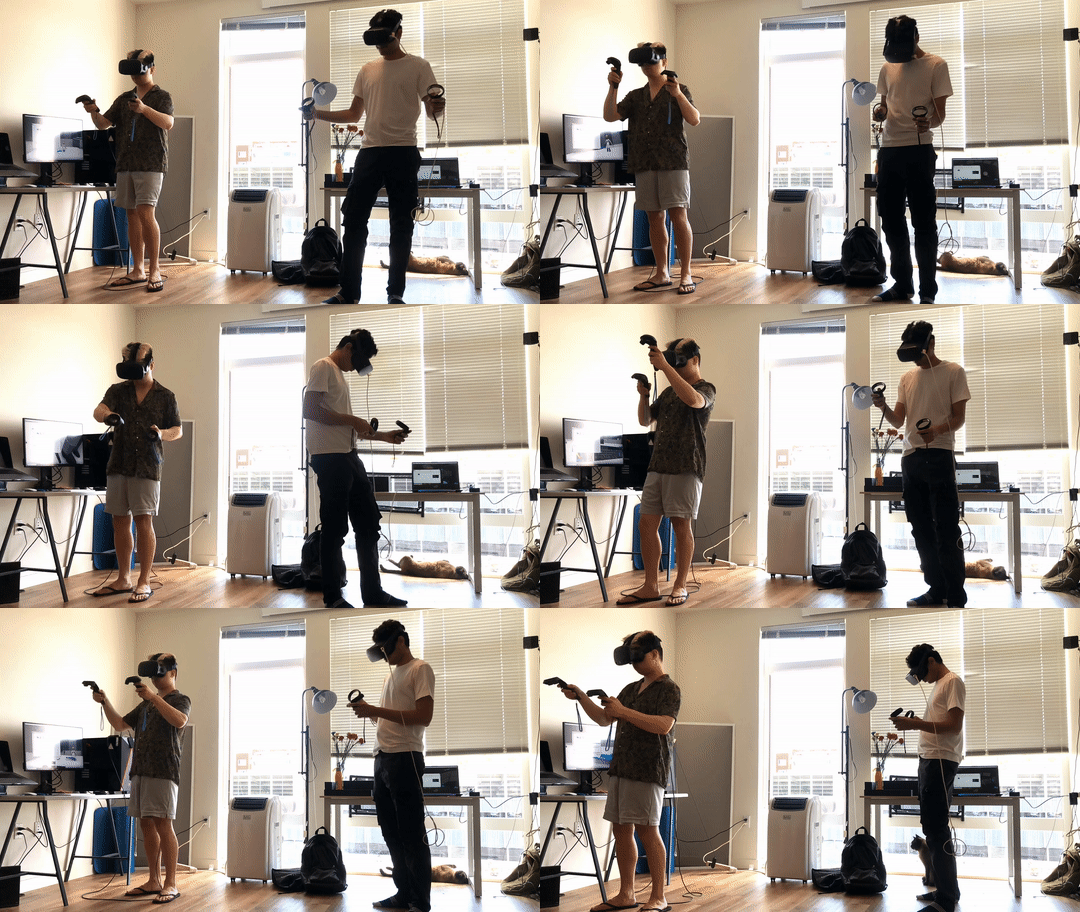
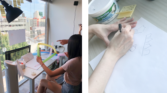
Bodystorming
Now that we’ve broken free from Maquette’s conventions, how do we add dimensions to our designs?
From our research, we realized that VR is just the replication of real life. If the interaction feels weird in the real world, then it might feel the same in VR. In order to fully understand the space around us, we decided to take a break from VR or any digital software and immerse ourselves in the physical world.
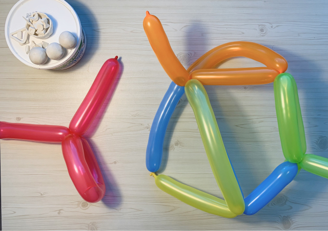
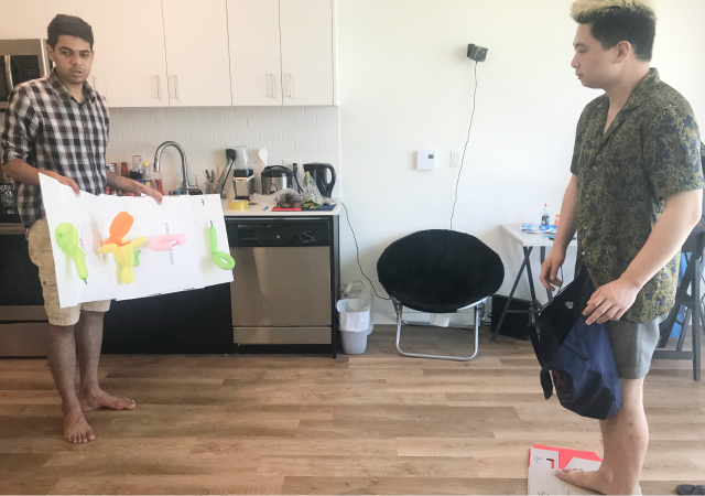
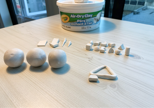
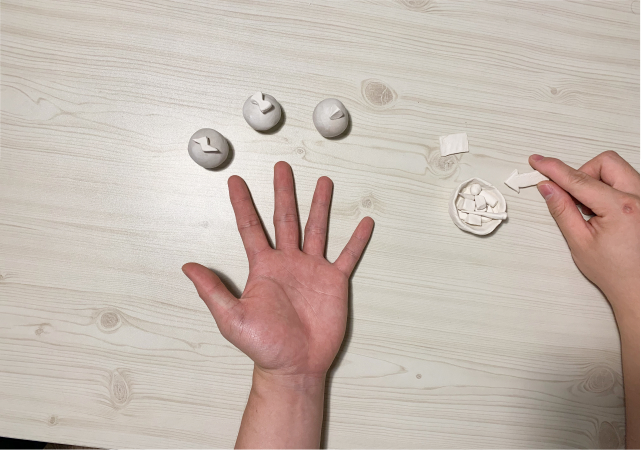
We got some balloons, clay, ping-pong balls, slimes, and straws, and use body-storming to ideat a bunch of interesting interactions. We made sure that they felt intuitive in the real world so that they could be translated over to VR seamlessly.
Challenges & Reflections:
After using controllers to build a prototype in Maquette, we realized that controller is not the most efficient way to prototype in VR. Our hand feels bit fatigue and the mental model of using the controller in different VR headset varies widely.
We started forming a hypothesis that using hand gesture tracking as input might be a better solution for fellowing reasons:
- Hands are highly approachable and low-friction input that requires no additional hardware.
- Unlike other input devices, they are automatically present as soon as you put on a headset.
- Self and social presence are richer in experiences where you’re able to use your real hands.
Co-Design Session
We used the wizard of the OZ method to conduct usability tests on 3 participants to test our hypothesis, opinions & ideas on annotation content, controller or hand-tracking, and prototyping methodologies.
Through the usability test, we hope to understand:
1. What annotations do users want to see in a VR project?
2. If users were to make their own VR projects, what kind of annotations would they put?
3. What do users think of controllers vs. hand tracking?
Insights:
1. Users Want Annotation About Interaction
Participants usually had no idea where to go or go to an unexpected place when they first enter the project. They want to quickly discover where to go and where to trigger the interaction. Users liked annotations on how to interact with objects, assuming that a reaction would follow
2. Hand Tracking Is Overwhelmingly Preferred
Users did indeed prefer hand tracking over controllers. One of the participants said, “This is what I wanted -- I want to be myself and have a feeling of creating without having to learn how to use a controller.”
3. Users Need Hand Coach for Some Gesture Interaction
Participants are familiar with gestures like grabbing, moving, rotating, but they have trouble with more complex gestures. They want some tutorials to demo the right posture for the interaction.
4. Users Need Flexible Annotation
Users had lots of unique ideas for their own VR projects and had differing ideas of what annotations they would make for them
Final Prototype
Challenge:
After generating so many creative ideas through body-storming, we struggled to communicate all our new interactions through static images or a lo-fi prototype. Because of this, I suggested using Tvori (the only software which supports building interactive VR prototype in the Current Market) to make the final design. However, I soon realized a few technical difficulties of Tvori after several tests:
1. Several features (interactive prototype recording, bundle animation, etc.) are not available for the free plan
2. The learning curve is low but the UI and interactions are hard to execute, especially with controllers. (i.e. use the controller to select a keyframe on the timeline is extremely hard)
3. Animate hand and fingers are gonna take forever
4. Imported 3D model doesn’t come with texture map
5. The software is not very stable and crashed several times while prototyping
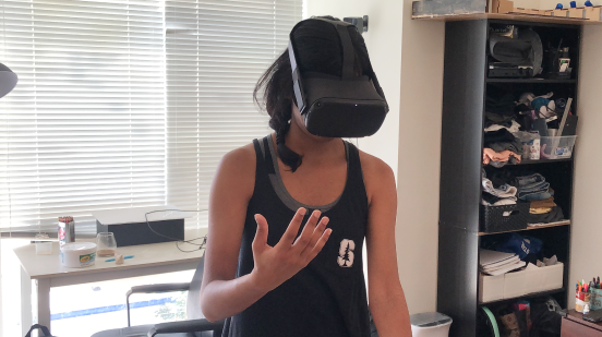
Here is me doing prototyping test in Tvori
Solution:
In order to fully convey our ideas and innovative interactions, I decided to create original motion animation using 3D software.
I asked my teammate to recorded hand gesture footage using Oculus hand tracking. Next, I used Cinema 4D to create 3D animation based on those hand gestures. After that, I used After Effects to combine two footage together in order to show how all the interactions work.

Design Iteration
Challenge 1: How to Preview the VR project?
From the research, we found out that users like to have an overall preview of a project before they decide to enter a particular VR project. However, using thumbnail images to represent the VR project is not engaging and does not give enough information to users.
Recommendation 1: God Eye View Preview
We learned about the importance of the top-down map and level design from our game designer SMEs and decided to show the preview in the god’s eye view to give the user the most information before they jump in. The key interactions will play automatically when users preview it.
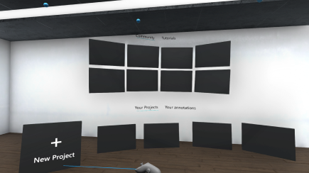
Before: Use thumbnail image to provide a preview. However, its not engaging and does not give enough information to users
V1: Inspired by the top-down map and level design concept from game design, we decided to use the god-eye view to allow the user to preview the VR project. However, the 1st version used a flat linear list arrangement which looks very flat.
After: I applied a cylinder style to the layout. The curved arrangement added depth and allow users to view more projects in an array format.
Challenge 2: When do users annotate their projects?
We initially thought users would annotate interactions while building a prototype. Thus we have annotation features and publish features on the same menu palet with prototype features. But soon, we realized that users often mess up with their design(i.e., move/rotate/delete assets, etc. ) while adding annotations.
Recommendation 2: Separate annotation and publish functions from the prototype menu.
We decided to divide the entire user flow into 3 modes: prototype mode, annotation mode, publish mode. Users need to use special gestures to switch mode. The color of the virtual hand will change to remind users of which mode they are currently at.
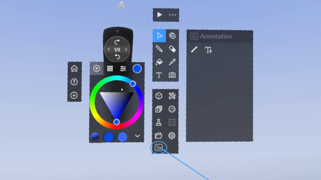
Before: The annotation and publish features were on the same menu palet together with other prototype features.
V1: Separate annotate and publish features from prototype features and require users to use special gesture to activate them
After: Improve visuals. Change hand color to remind users which mode they are at.
Challenge 3: Where should we put the annotation menu?
The annotation menu will show up after users enter the annotation mode. Originally, we have menu anchors to users’ left hand to make it easy for users to add various annotations. However, during the usability test, we find several flaws with this design:
1. Users often mistakenly trigger features while manipulate the annotation using their left hand.
2. Users feel fatigued cause they need to always bring their left hand to trigger annotation function
Recommendation 3: Have the menu floating in the air and anchor to the user’s body.
In the 1st iteration, we decided to have an annotation menu only show up when the camera recognizes the palm while hidden when users flip their left hand. However, users are still not satisfied with this design. For the final iteration, we decided to have the menu floating in the air while anchor to users' bodies so it can always fellow users.
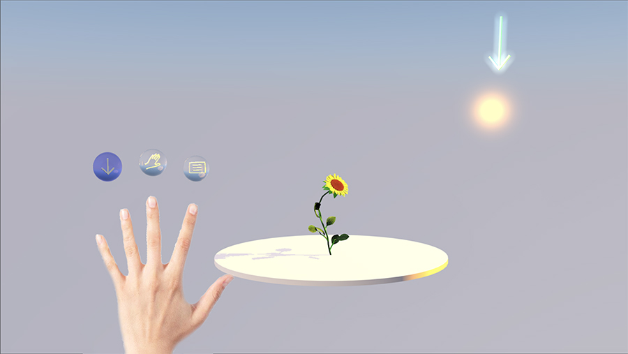
Before: Menu is aligning and showing up on the top of the left hand. User feel fatigued with this design cause they need to always bring the left hand up to use annotation function
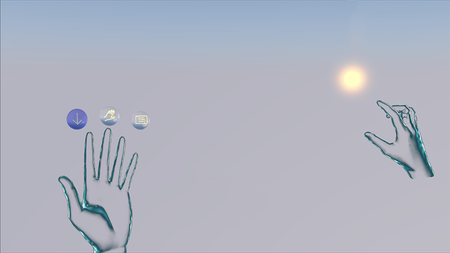
V1: Menu only show up when users show their land hand plam. Users found out that its very easy to mistakendly trigger the annotation function while manipulate the annotation UI.
After: Menu is floating in the air and anchor to users' bodies.
Challenge 4: How to simplify the text input?
We added text annotation to accommodate user’s needs. However, during the usability test, we noticed all of our participants mentioned that typing in VR is extremely difficult, especially with controllers.
Recommendation 4: Using audio to text to input text.
To reduce the difficulty of text input, we decided to leverage voice UI to use audio to text function to convert spoken word to text.
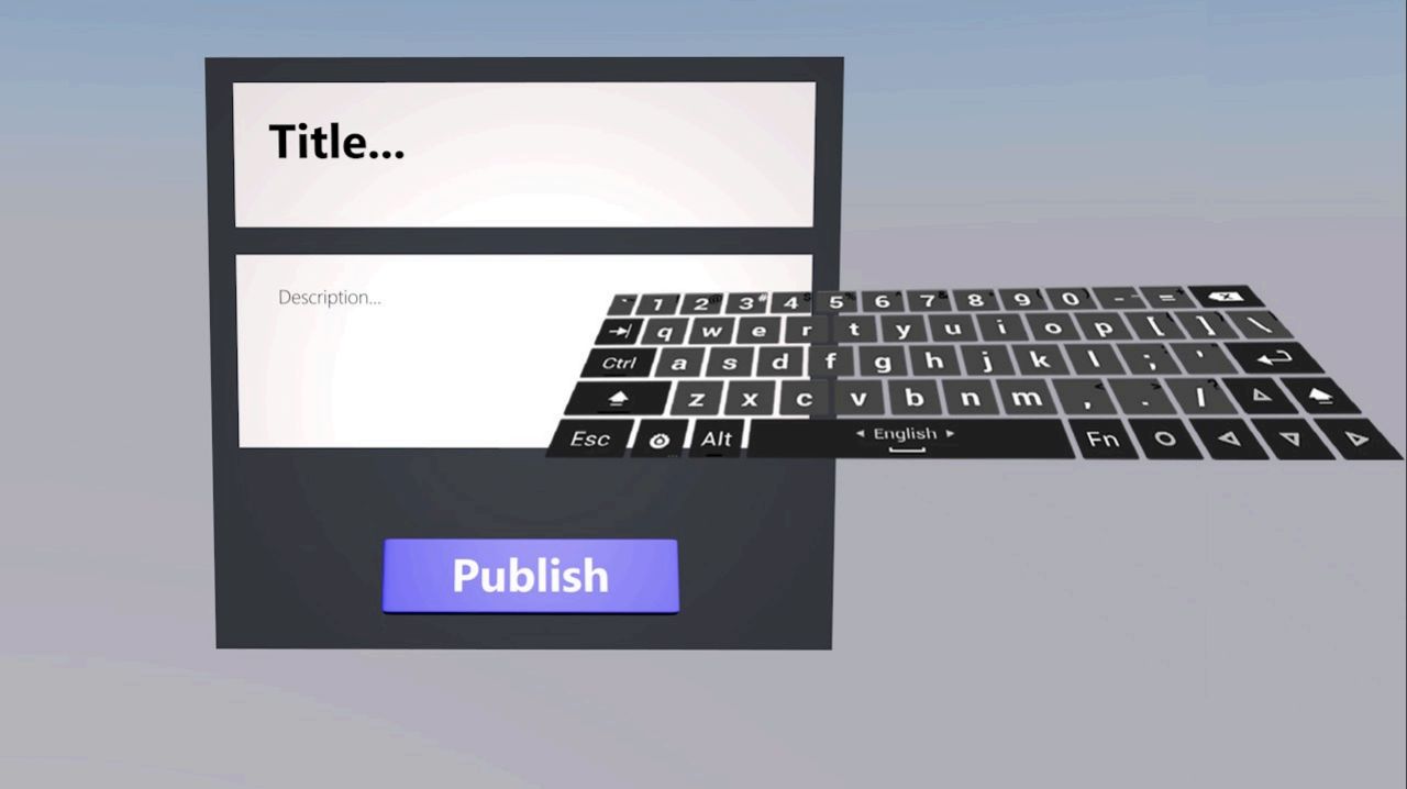
Before: User use the virtual keyboard to type text
After: Users use voice UI to convert spoken words to text.
Final Design (Interaction Flow)
Creator Side
Activate Annotate Menu
After creators finish building their interactive VR project, they do a long pinch with their thumb and index finger on their right hand to bring up a high-level menu. Then they slide towards the direction of annotating to activate the annotate menu. The color of the hand will change from green to blue to tell the user that they are in the process of adding annotation instead of building their prototype.
Creator Side
Adding Annotation: Signifiers
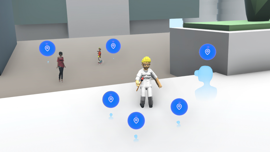
The first type of annotation is signifier, which means to go here or interact with this object. Creators grab the “signifier” annotation from the menu and use it to point to the asset to denote the actionability.
Creator Side
Adding Annotation: Ghost Hand
The second type of annotation is the ghost hand, which demonstrates the correct posture that a user should take to interact with the object. To use a ghost hand, the creator selects it from the menu and put it to their preferred place. Then it will transform into a window. The creator put their hand inside the window and record the hand posture within the allotted 5 seconds.
Creator Side
Adding Annotation: Audio to Text
The final type of annotation is the text annotation. The creator grabs the text box from the menu and uses the audio-to-text function to convert spoken word to text. The red dot on the text box will start pulsing to provide visual cues to indicate its time to speak. If they are not satisfied with the output, they can shake the box to delete the input and redo the annotation.
Creator Side
Activate Publish Menu
After creators finished adding annotations, they do a long pinch with their thumb and index finger to bring up a high-level menu. Then they slide towards the direction of publishing to activate the publish menu. The color of the hand will change from blue to yellow to tell the user that they are in the process of publishing their project.
Creator Side
Add Metadata and Publish to Vault
Users need to add title and description metadata using the audio-to-text function. They click the microphone icon on the UI to input the metadata. And with a single click of the publish button, the project is now live on the Vault platform.
Learner Side
Browse Other People’s Project
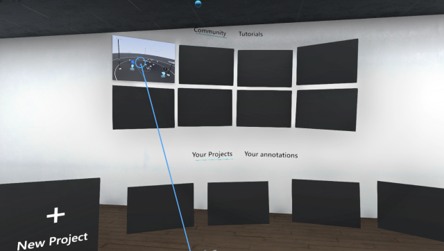
When learners arrive at the community, they can swipe back and forth to browse through unique creations uploaded by other creators.
Learner Side
Preview the Project Before Jumping in
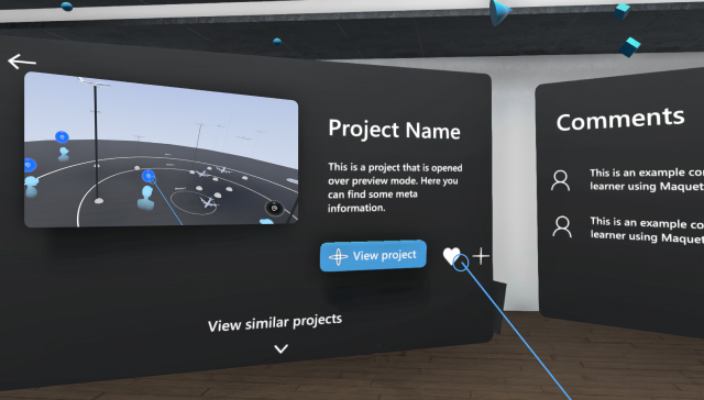
Then, if they find any project interesting, they can grab that project and pull it toward them. The project will float in the air, showing the metadata and comments. Users can rotate it to view the projects from different perspectives. The key interaction of the project will also play automatically to give the user a quick preview.
Learner Side
Search for Annotation
When learners jumping into a particular VR project, they will see several glowing blue annotations that give them some instructional cues and then teleport there. The purpose of the annotation is to tell the learners about instructions on how to interact with the object in the scene they built.
Learner Side
Engage with Annotation
Learners follow the ghost hand and text box annotation to learn the right-hand posture and instruction to interact with the asset/object in the scene and observe the changes.
Learner Side
Recommend, Comment Project
When users go back to preview mode, they can click the like button to recommend projects to bring the best projects & interactions to rise to the surface. They can also use the comment function to ask questions, leave feedback, and complement each other’s work.
Takeaway
1. During our research phase, we learned about many pain points that VR designers struggle with. By working on this project, we encountered them personally. The decision to choose to learn new software is hard and actually using it in the way we want it is even harder.
2. If design specifications, however detailed, don’t take into account the exact technological constraints of the software used to build the actual product, then they aren’t useful. Therefore, we learned we needed to jump right into the headset and the software.
3. In that same way, in order to properly convey ideas to others (especially remotely), we needed to actually build a tangible prototype and use motion to demonstrate the full functionality.
Special Thanks To
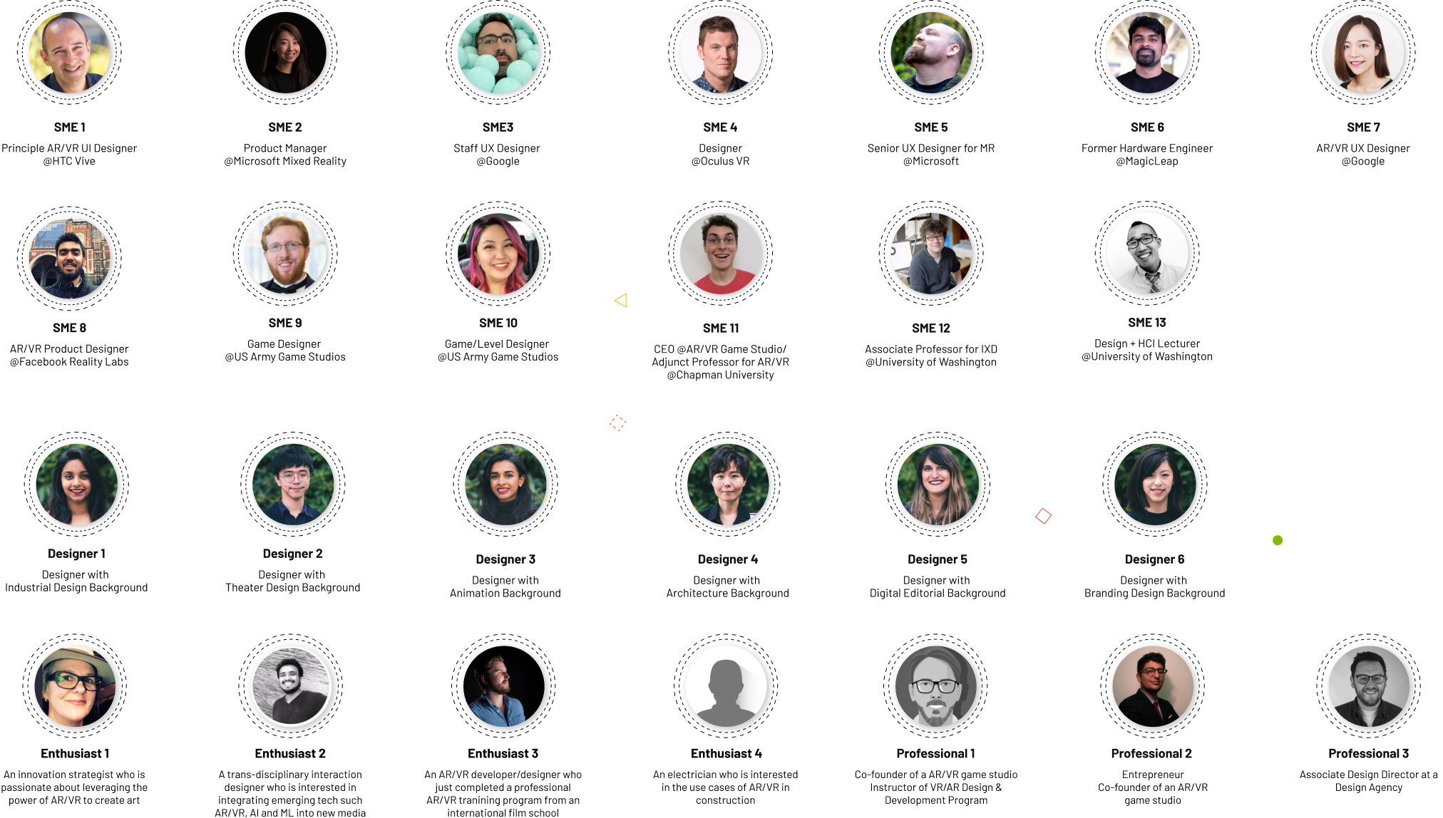
The following are SMEs and target users we interviewed through this project. Seattle is the HUB of AR/VR/MR/XR, we were very lucky to have a chance to talk to multiple people who are working in the major reality technology companies like Microsoft Hololense, Facebook Reality Lab, Oculus, HTC Vive, Google Daydream, and MagicLeap. People in this filed are very passionate and willing to share their experiences and wisdom with us. We are very appreciated!
© Harri Lin 2023
